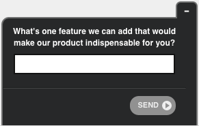
Survey fatigue is real, but the deeper problem is interruption cost.
Every feedback prompt you show a user carries a cognitive price: it pulls their attention away from the task they came to complete, forces them to context-switch, and asks them to evaluate an experience they may still be in the middle of having.
The risk is not just that users ignore the survey. It is that a poorly timed or poorly placed prompt actively damages the experience you are trying to measure.
A user who abandons a checkout because a feedback modal blocked the payment button is not going to give you useful data about checkout friction. They are going to give you data about the survey.
Minimizing that interruption cost requires thinking about more than survey length. It requires understanding user intent (what the user came to do), task context (whether they have finished doing it), channel differences (desktop vs. mobile vs. in-app behave differently), and format (not all feedback mechanisms are equally intrusive).
The sections below cover each of these in the order they matter most for survey design.
Timing Is Everything
This is the number one rule in gathering user feedback: when your customer is in the sales cycle, don’t disturb them. Converting customers is the goal, after all.
If I’m trying to drive sales, I’m not going to ask for feedback; a better option would be to ask around milestones, such as signing up for a newsletter or just after making a purchase. These are perfect opportunities to ask a question gauging their experience.
The same goes for missed milestones. If a customer is abandoning their cart or navigating away from a landing page without taking action, prompt them with a question about why they’re leaving without completing the action. This type of feedback adds context to funnel statistics you may already be recording, making the data more actionable.
Task-completion triggers are more reliable than time-based triggers. Showing a survey after a user has been on a page for 30 seconds tells you they have been present, not that they have accomplished anything.
Triggering on task completion, such as after a form submission, after a support ticket closes, after a feature is used for the first time, or after a checkout confirmation renders, captures the moment when the experience is both complete and fresh. The data quality difference between the two approaches is significant.
Mobile-First Timing Considerations: Mobile users operate in shorter, higher-intent sessions than desktop users. They are more likely to be mid-task and less tolerant of interruption. On mobile, time-on-page triggers are particularly unreliable because background tabs, phone lock events, and multitasking all inflate session time without indicating engagement. Use interaction-based triggers (button tap, scroll depth past a threshold, successful form submission) rather than time-based ones for mobile audiences.
Notification Fatigue Across Channels: If your feedback program spans email, in-app, SMS, and push notifications, a user can receive multiple requests within the same week from different teams with no coordination.
This is one of the fastest ways to produce hostile survey abandonment rather than neutral non-response.
Establish a suppression window at the user level across all channels, not just within individual survey triggers. A 14-day cross-channel suppression window is a common starting point.
Be Strategic with Placement
Getting to real “moments of truth” when gathering feedback from users is no easy task; however, we’ve found that placement makes a difference.
For SaaS products, placing surveys within the product interface is generally more effective than email follow-ups because the context is immediate and the user is already engaged. However, the dashboard itself is a high-intent workspace. Users who have just navigated to the dashboard are oriented toward completing a task, not evaluating an experience.
The more precise trigger is after a specific action within the dashboard: after a report is generated, after a workflow is completed, after a feature is used for the first time, or after a meaningful milestone such as a first successful integration. Prompting at those moments means the experience you are asking about is still active in the user’s memory, and the user has already achieved something, which reduces the cost of the interruption.
Two benefits remain: (1) you capture feedback in the authentic context of product use rather than in a retrospective email, and (2) users who respond in-product tend to give more specific, actionable answers than those responding from a detached survey link hours later.
This type of unbiased feedback is vital, especially when measuring your Net Promoter Score (NPS).
Bonus Read: SaaS Marketing Strategies : Techniques to Grow Your Business
Great design shapes the way users interact with your site. If an on-site survey prompt is laid over text or relevant content, it not only draws the user’s focus from the call to action, it also prevents the user from gathering all the information they need to make a decision.
On desktop, placing survey prompts in the bottom right corner of the page is a reasonable default. It sits outside the primary content area and does not block navigation or calls to action.
On mobile, the bottom right corner is problematic. It conflicts with native browser navigation controls, overlaps with floating action buttons and cookie consent banners, and falls in the thumb zone where accidental taps are common.
For mobile, a bottom sheet that slides up from the full bottom edge, or an inline prompt that appears after a specific user action, is less likely to create interference. Test placement on actual mobile devices before assuming your desktop logic transfers.
Blocking vs. non-blocking formats matter more than position. The format of the feedback prompt has a larger impact on interruption cost than its screen position. Consider the spectrum from most to least intrusive:
Full-page interstitials and modals with mandatory dismissal are the most disruptive. They halt the user journey entirely and force engagement before the user can proceed. Reserve these for post-completion moments where the task is definitively finished, such as after a file download or account cancellation.
Slide-in prompts and bottom sheets appear without blocking content and can be dismissed with a single tap. They are appropriate for mid-journey triggers where you want visibility without stopping the user.
Inline survey questions embedded in the page or app interface have no overlay at all. They appear as part of the content flow and are seen only if the user scrolls to them. Completion rates are lower, but response quality tends to be higher because only engaged users respond.
Passive feedback tabs and persistent feedback buttons give the user full control over when they engage. They are always available but never interrupt. They work well as a complement to triggered prompts, capturing feedback from users who were not targeted or who chose not to respond to an active prompt.
Accessibility Considerations for Feedback Prompts
A feedback prompt that is non-intrusive visually can still be highly intrusive for users who rely on assistive technology if it is not implemented accessibly.
Key considerations before deploying any survey format:
Keyboard Focus Management: When a slide-in or modal prompt appears, keyboard focus should move to the prompt so that keyboard-only users are not stranded behind it. When the prompt is dismissed, focus should return to the element the user was previously interacting with. Prompts that do not manage focus correctly can trap keyboard users or cause them to lose their position in the page.
Screen Reader Behavior: Use appropriate ARIA roles for dialog elements (role=”dialog” with aria-labelledby and aria-describedby). For non-blocking prompts that appear without interrupting the main content, use ARIA live regions (aria-live=”polite”) so screen reader users are informed of the prompt without it forcibly interrupting their current task.
Avoid Inaccessible Overlays: Any prompt that uses a backdrop overlay must ensure the background content is inert while the overlay is open. Screen readers and keyboard users should not be able to interact with content behind an active dialog.
Contrast and Tap Target Size: Ensure dismiss buttons and scale options meet WCAG 2.1 AA contrast ratios (4.5:1 for normal text) and that interactive elements meet the minimum tap target size of 44 by 44 CSS pixels for mobile use.
Test with assistive technology before launch. Screen reader behavior, in particular, is not predictable from visual inspection alone.
Passive Feedback Options: Give Users Control
Not every feedback mechanism needs to be initiated by you. Passive, user-initiated options give users the ability to leave feedback whenever they choose, without being prompted.
A persistent feedback tab on the edge of the screen, or an embedded feedback button within the product interface, makes the feedback channel permanently available. Users who have strong opinions, whether positive or negative, can engage on their own terms. Users who are mid-task can ignore it entirely with no interruption cost.
Passive options have lower response volumes than triggered prompts, but the responses they generate tend to come from users with specific, motivated feedback. A user who sought out the feedback button had something they wanted to say. That signal is qualitatively different from a user who was prompted mid-session and clicked through to dismiss the request.
The most effective feedback programs use both triggered prompts for systematic measurement at defined touchpoints and passive mechanisms for capturing unsolicited, high-signal input between those touchpoints.
Suppression Logic and Frequency Caps
Frequency capping and suppression rules are among the most important protections against survey fatigue, and they are almost always underconfigured.
At minimum, implement these rules before launching any feedback program:
Per-User Cooldown: Once a user has received a survey prompt, suppress all further prompts for a defined window regardless of their response. A 14-day minimum is standard. If the user completed the survey, extend the window to 30 days or more. If they dismissed it, consider extending it further, as a second prompt within a short window to a user who already declined is likely to generate hostility.
Cross-Channel Coordination: If product, support, marketing, and customer success are all running surveys independently, a single user can receive multiple requests within the same week from different sources. Suppression rules set at the individual survey level do not solve this. You need a user-level suppression flag that is checked across all active survey programs before any prompt is shown or sent.
Exclude Users in Specific States: Users in active support escalations, users within their first 3 to 7 days of onboarding, and users who have recently churned or requested cancellation should be excluded from standard survey triggers. Surveying a user mid-escalation before the issue is resolved introduces friction at the worst possible moment and produces data that reflects the escalation, not the general experience.
Set a Response Cap per Survey: Once a survey has reached the sample size required for reliable analysis, deactivate it or suppress it for new users. Continuing to prompt users after the data goal is met collects noise and burns goodwill unnecessarily.
Keep It Short
Companies want to know everything about the customer’s wants, needs, preferences and turn-offs. In theory, this is great news, but communicating that information is time-consuming for the customer.
Rather than present a lengthy survey about several experiences the customer has had over their journey, it’s far more effective to use shorter surveys at multiple touch points throughout the customer’s journey. This practice makes consumers more willing to actually respond and give honest feedback rather than simply clicking through to “get it over with.”
There is a tradeoff worth understanding explicitly: less intrusive methods generally produce lower completion volumes but higher response quality, while more intrusive prompts produce higher volume but introduce self-selection bias and a higher proportion of low-effort responses from users who engaged only to dismiss the survey.
A modal that blocks the page until dismissed may show a 40% completion rate in your dashboard. But a portion of those completions are from users who selected any answer to make the prompt disappear. An inline embedded question with a 12% completion rate may produce a more honest and representative dataset because only users who chose to engage did so.
When setting targets for your feedback program, define what success looks like in terms of response quality, not just volume. A useful proxy is open-text completion rate on follow-up questions: if users are engaging with the optional “why” question at a reasonable rate, they are genuinely responding rather than dismissing.
Here are a few tools you can use to gather your feedback without disrupting user experience:
Conclusion: Keep Customers First
Designers and marketing professionals can easily get caught up in gathering customer feedback and lose sight of the bigger goal: to solve a customer’s problem. Using these best practices will create a space where users feel comfortable providing feedback and ultimately become invested in forming a relationship with your company.
FREE. All Features. FOREVER!
Try our Forever FREE account with all premium features!

 We'd love your feedback!
What did you like & how can we make it even better?
 Thanks for your feedback!
 Ask Your Question
Have a question? Get expert help to make your decision easier.